BTD Curb Management Platform
Designing a geospatial data platform for the Boston Transportation Department to visualize curb assets and parking regulations across city streets.
Role
UX Designer
Industry
Civic / Geospatial Technology
Duration
6 months

Overview
As Product Designer and Operations Lead at PolaGIS, I led a pilot project for the Boston Transportation Department to design a centralized curb management platform. The goal was to make street-level assets such as parking meters, signs, hydrants, and curb cuts easier to track, interpret, and manage through a unified digital tool.
Context
Curb assets are the physical elements that support how a street functions, including parking signs, traffic lights, hydrants, curb cuts, and meters. Although cities rely on this infrastructure every day, many municipalities still lack accurate digital records of where these assets are and what regulations apply to them.
Boston Transportation faced this challenge directly. Their existing geospatial data, collected through cellphones and measuring wheels, was not accurate enough for operational use. PolaGIS was brought in to explore how a platform could better display curb asset locations, attributes, and the parking regulations tied to them.
The core challenge:
How might we display dense, overlapping geospatial data and the regulations tied to it without overwhelming the people who need to use it?
Understanding the Problem
Because there were few comparable products in this space, I could not rely on standard patterns or strong competitive references. Instead, I met with stakeholders across Boston Transportation’s transportation, parking, and operations functions to understand their workflows, pain points, and priorities.
A few themes stood out:
Street assets and regulations were not well recorded in one place
Existing tools lacked accurate data and had no clear maintenance model.
Staff could not easily tell what regulations or tickets applied to a specific location
Displaying parking sign content and what it means spatially was a real unsolved problem*.*
One stakeholder put it simply:
“We need to think about how we want the map to convey the message on the sign.”
From those conversations, I defined three design goals:
Show accurate locations of curb assets
Let users inspect asset details and attributes
Visualize parking regulations based on the locations and attributes of parking signs
Separating the Problem: Two Maps
After early discussions, it became clear that trying to show everything on one map would overwhelm users. The asset data and the regulatory data served different tasks and different mental models.
To simplify the experience, I separated the platform into two connected views:
Asset Map
A GIS-style view focused on asset locations and attributes. I followed familiar GIS conventions, placing the legend on the left and the attribute panel on the right to reduce the learning curve for users already comfortable with map-based tools.
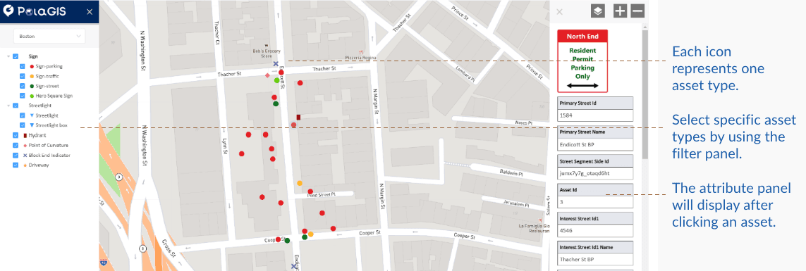
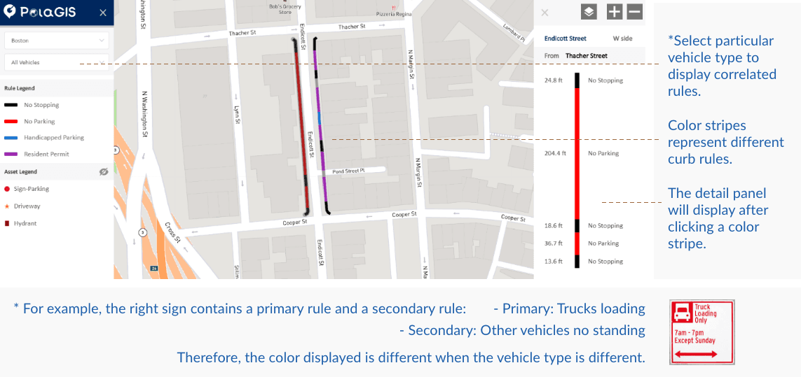
Curb Map
A regulation-focused view that helped users understand what rules applied in a given place. Because parking regulations are determined by sign content such as object type, time window, day, and restriction, I designed filters around those variables so users could interpret curb rules more directly instead of reading raw sign data.
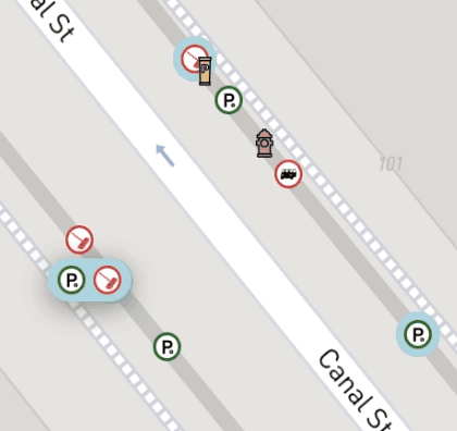
The Hardest Problem: Overlapping Assets
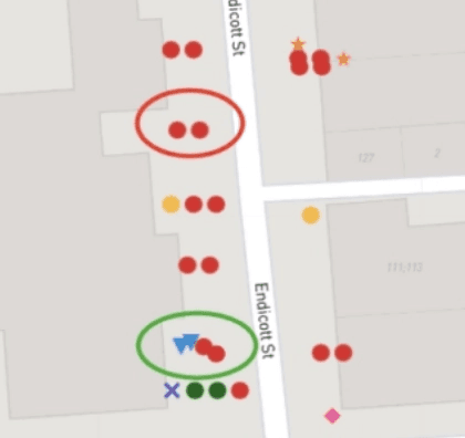
After optimizing asset coordinates, a new challenge emerged that I hadn't anticipated: many assets overlap on the map.
This was not a data-quality issue. In the real world, multiple signs are often mounted on one pole, and other assets such as meters may sit immediately beside them. Plotting everything accurately made the map hard to read.
To solve this, I explored four approaches:
Version 1: Natural display
Assets were shown as-is. This preserved spatial accuracy, but overlapping items were difficult to distinguish.
Version 2: Boundary grouping
I used visible boundaries to cluster assets at the same location. This clarified relationships at close zoom levels, but became visually noisy when zoomed out.
Version 3: Transparent grouping
I tested transparent grouping to soften the visual weight of clusters, but the see-through effect made nearby assets harder to interpret.
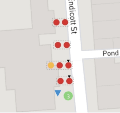
Version 4: Solid background grouping
I replaced the transparent grouping with a solid background, which made overlapping assets easier to distinguish without introducing as much visual confusion.
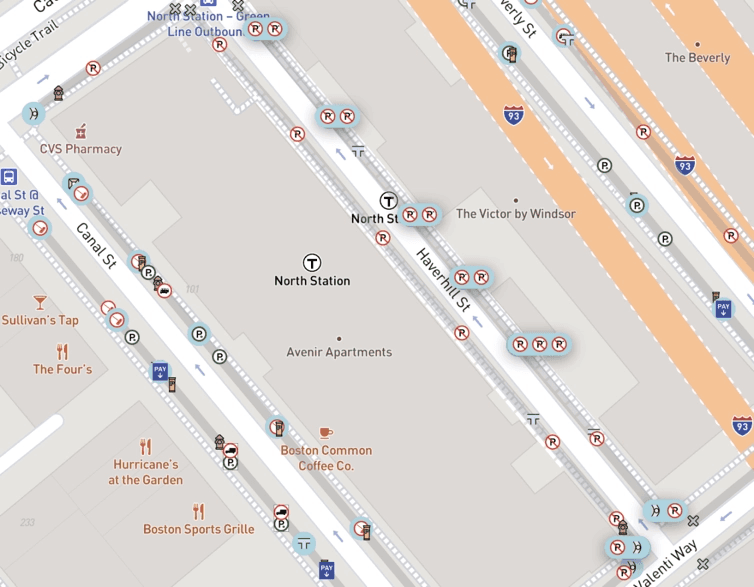
In the final concept, clicking a grouped asset expanded the cluster to reveal each item individually. Users could also click the light gray connector lines along a street segment to expand all co-located assets at once, which made it easier to scan an entire block. Hover was reserved for revealing partially obscured icons.
Outcome
The pilot was completed successfully, and the client responded positively to the prototype:
"PolaGIS efficiently and effectively delivered an accurate and user-friendly output application."
The engagement did not continue beyond the pilot for reasons outside the project itself, but the work served its purpose as a proof of concept for how a city-scale curb asset platform could be structured and visualized.


Reflection
This was my first time designing for an external government client, and it pushed me to work through ambiguity in a domain with few established patterns. Rather than starting from a familiar product model, I had to translate specialized operational needs into something stakeholders could see, react to, and refine.
It also reinforced something that continues to shape my work: I am most engaged when the problem is information-heavy, messy, and difficult to explain at first. In those situations, design is not just about interface polish. It becomes a way to structure complexity and make unfamiliar systems easier to understand.
Other projects

AAA Membership Purchase Integration
Integrating AAA membership into an existing insurance quoting flow, resulting in a 30% increase in online policy purchases.
MyPolicy App: Scalable UX Improvements
Improving a fragmented legacy insurance app for 100k users through high-impact, incremental changes that bridge marketing insights and UX heuristics.

Obran OS Redesign
A systems-level redesign of a cooperative platform to clarify financial structures, membership, and internal capital accounts.
