Obran OS Redesign
A systems-level redesign of a cooperative platform to clarify financial structures, membership, and internal capital accounts.
Role
UX Designer
Industry
Finance
Duration
1 year

The Challenge
Obran is a worker-owned cooperative where employees are also owners. Its central platform, Obran OS, is meant to support members, administrators, and leadership across finance, communication, and operations.
However, the platform wasn’t meeting member’s daily needs. Engagement was low and the Internal Capital Account (ICA), a core concept of cooperative membership, felt disconnected from the members' daily lives.
Under a design sprint framework, our goal was to redesign Obran OS to transform it from a utility tool into a community-driven ecosystem.
Unpacking the Complexity
We started with a lot of ambiguity. Concepts like ICA weren’t familiar to us, so the first step was understanding how the system actually worked.
Through stakeholder interviews, we clarified two key points:
The ICA Problem: ICA tracks each member’s investment and profit distribution. It represents the financial proof of ownership, yet most members rarely checked it.
The Goal: Increase members’ meaningful engagement with their ICA to help fulfill Obran’s long-term business needs.
Understanding the “Why” Behind the Disconnect
We interviewed 6 existing members and new hires to understand their experiences.
What we found was that the issue wasn’t just ICA. It was the broader environment around it:
Lack of context: Members didn’t see how their ICA connected to their role in the cooperative.
Information silos: Critical information like payroll, benefits, and events were scattered across emails, Slack, and other platforms.
Design friction: Navigation and hierarchy made even simple tasks harder than expected.
This led to a key shift in direction:
We couldn't just "fix" the ICA. To make members care about their capital accounts, we had to make Obran OS the place where they managed their cooperative life.
Concept Development and Iteration
We explored patterns across FinTech, community platforms, and enterprise tools to understand how complex systems organize user information.
From there, we developed low-fidelity wireframes and interactive prototypes, followed by multiple rounds of moderated usability testing with 5 participants per round.
What we learned
Members wanted a personalized view of their own data, with payroll and benefits as the primary reason to return.
A centralized member hub could improve engagement.
Reorganized navigation significantly improved task confidence.
With each iteration, the system shifted from feature-driven to member-centered.
A Human-Centered ICA Redesign
I led the redesign of ICA to make complex financial data more understandable and meaningful.
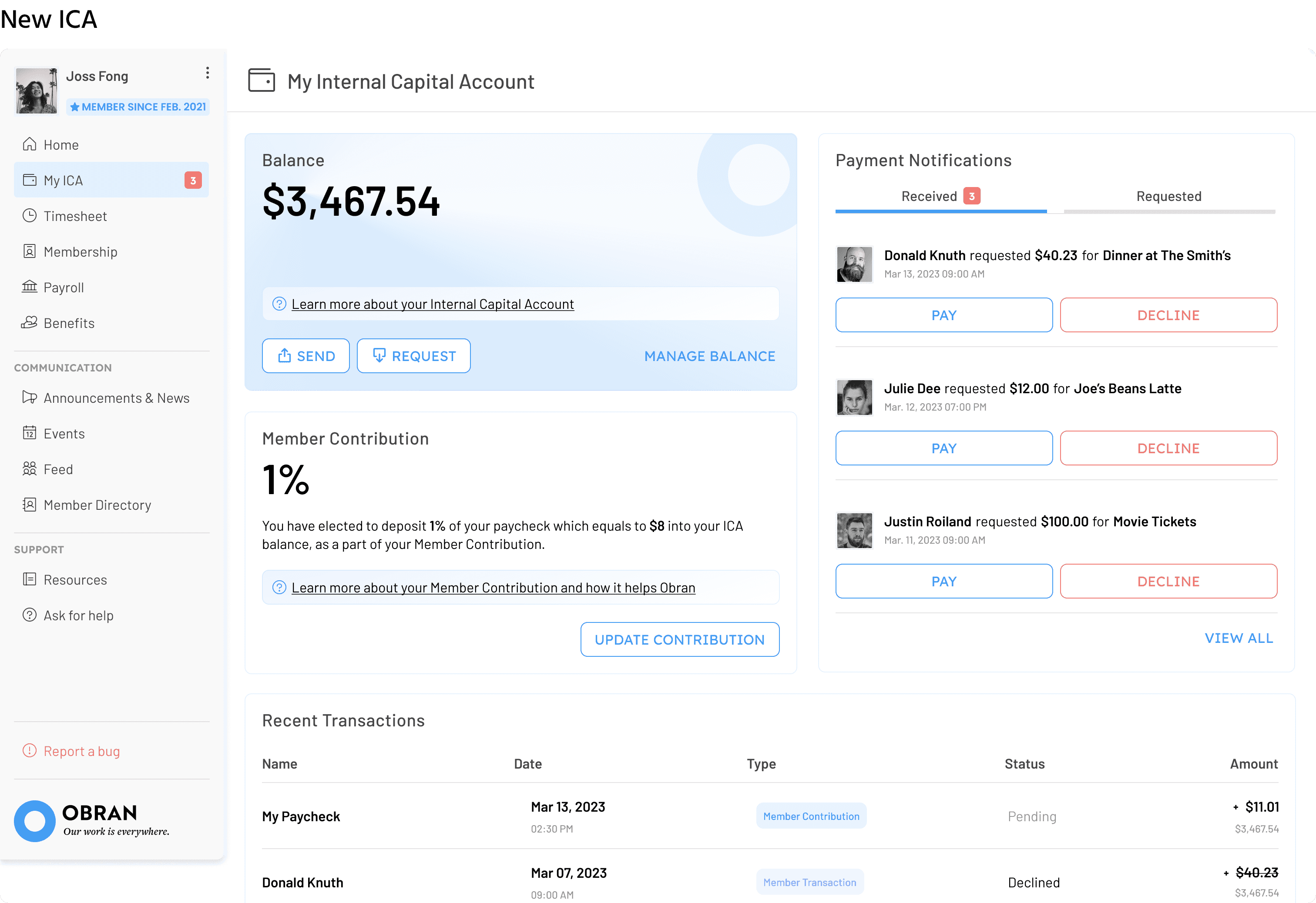
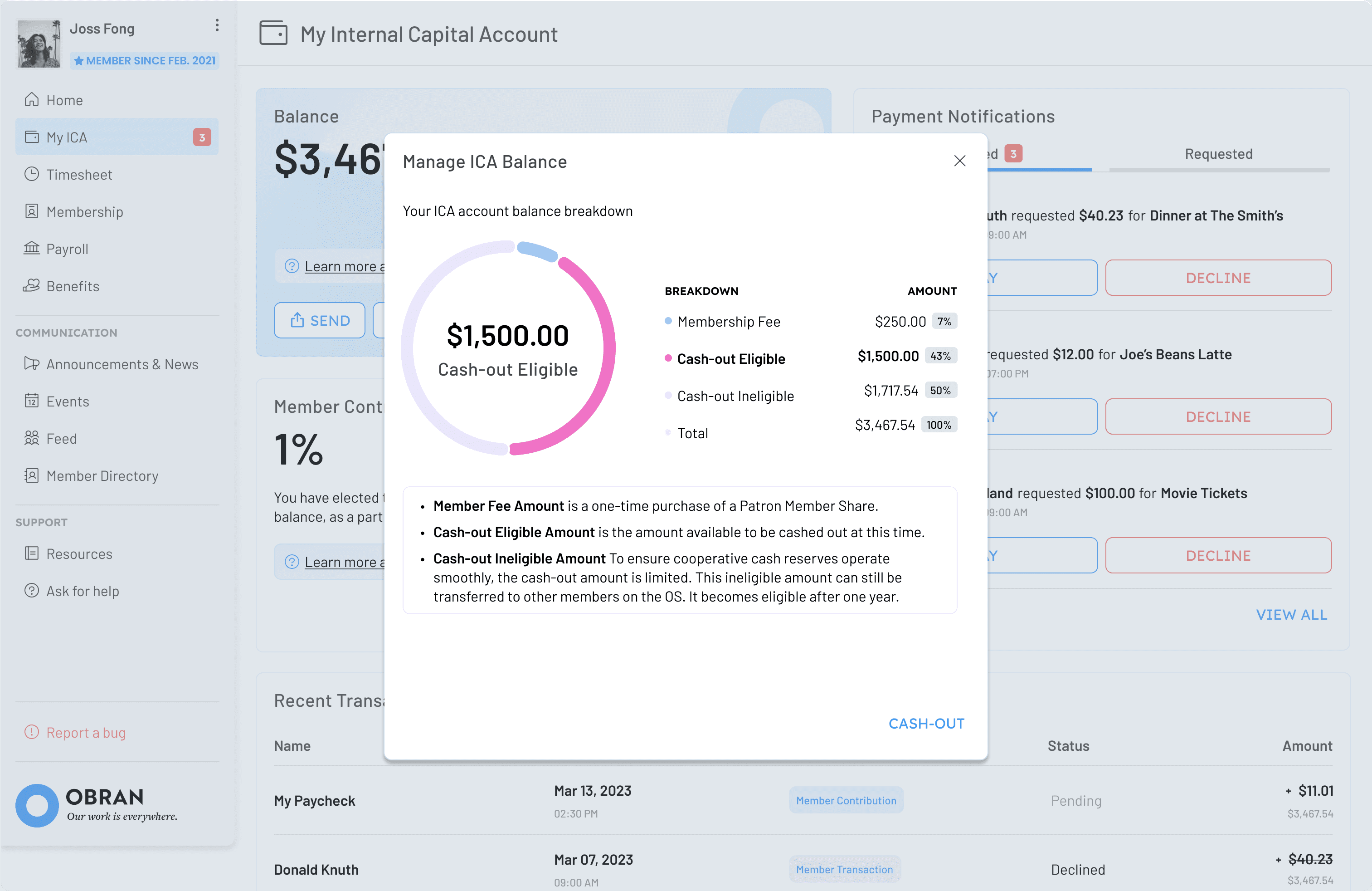
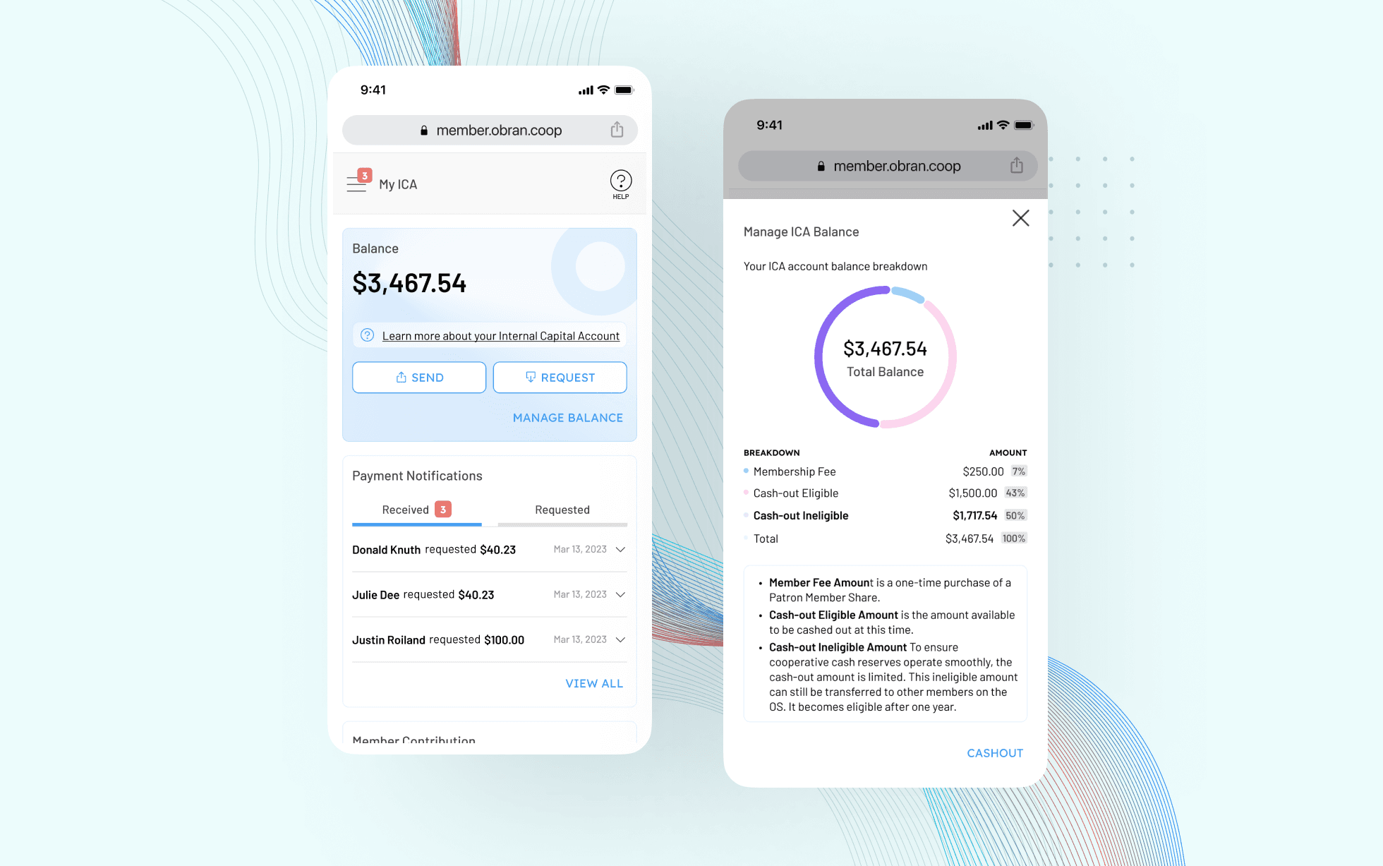
A Balance-Focused ICA Dashboard
The original ICA was just a list of transactions.
I redesigned it to focus on ownership and clarity:
Highlighted the balance as the primary signal
Grouped key actions such as send and request near the balance
Structured transaction history for easier scanning
Added contextual education to explain cooperative concepts without overwhelming users
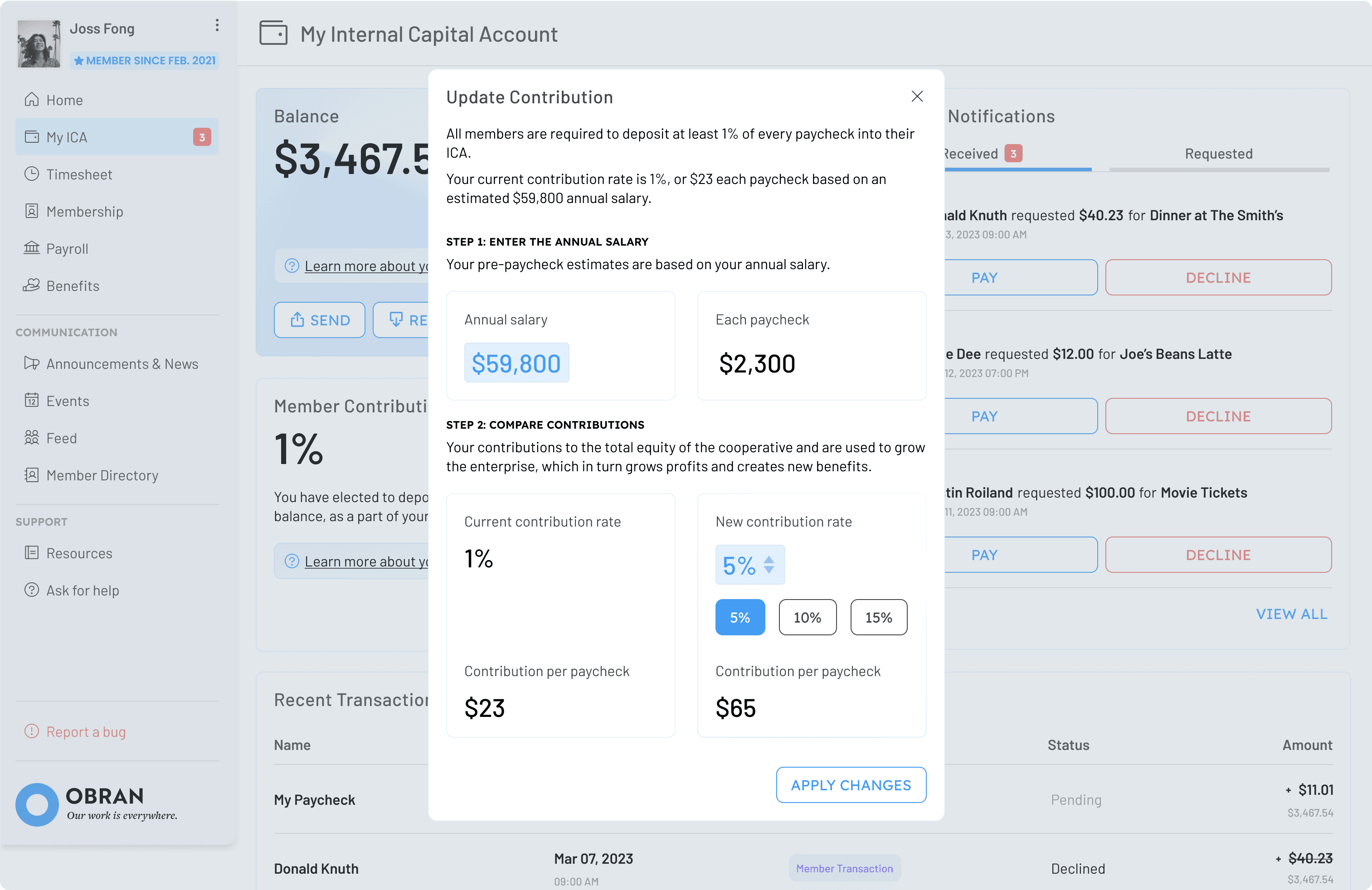
Guided Contribution Calculator
Obran’s growth depends on member contributions. To support this, I designed a contribution calculator that:
Breaks the process into clear steps
Explains financial impact in simple terms
Shows how contributions benefit both the member and the cooperative
Centralizing the Member Experience
To drive daily engagement, we focused on what members already needed:
Payroll & Benefits: We integrated cross-platform data so members could access pay stubs directly.
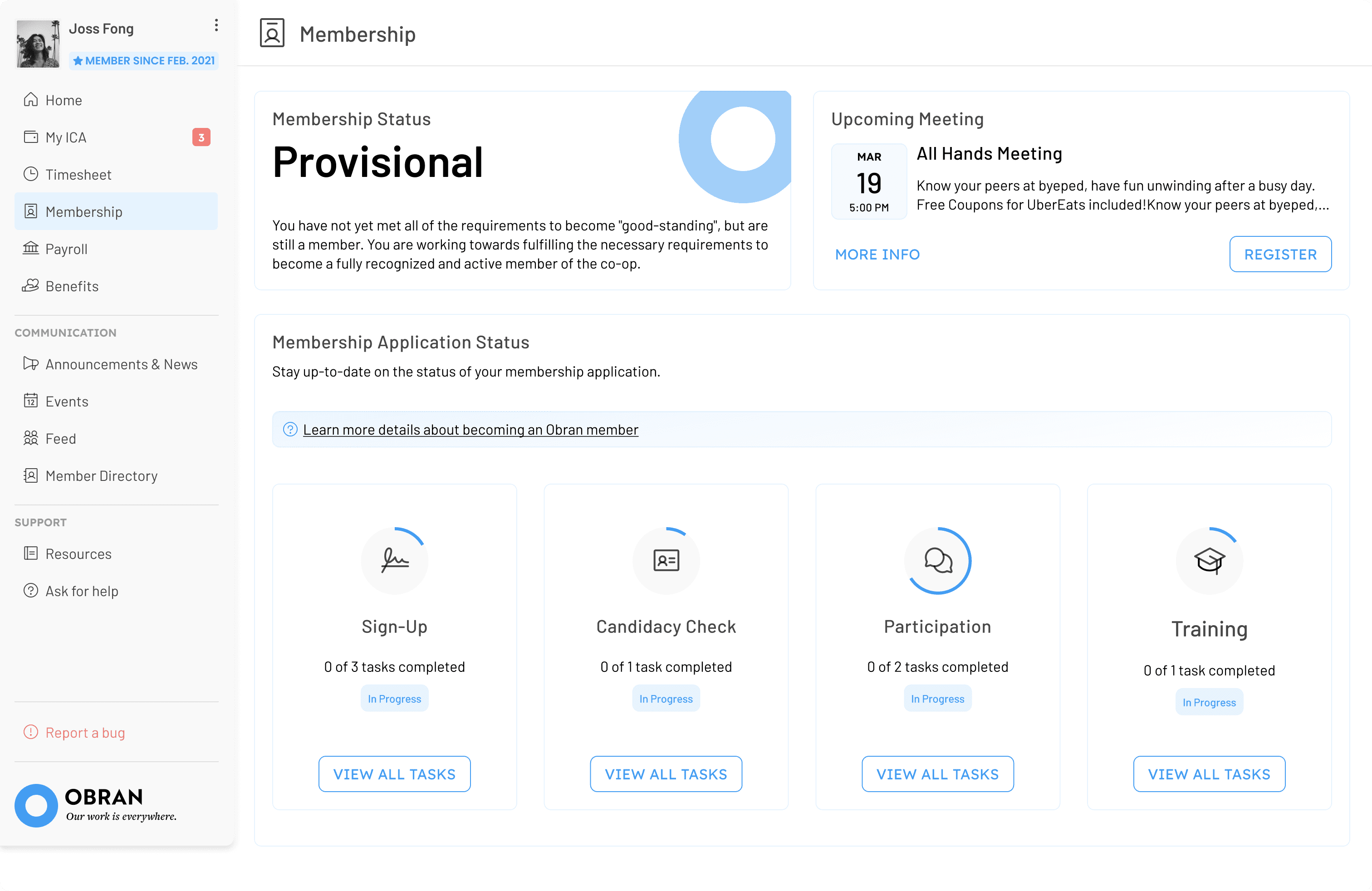
Membership Center: We introduced a "gamified" status tracker. Instead of calling an admin, members can now see their training progress and membership tier in a visual, rewarding interface.
Community Channels: We replaced scattered communication with a centralized space for updates, events, and a member directory
Results
The redesign repositioned ICA from a basic transaction list into a clearer, ownership-focused experience within a more cohesive system.


Key improvements included:
Information architecture centered around member priorities
Improved visibility into ICA balance and contribution impact
Centralized communication and membership tracking
A foundational design system to support future development
We delivered detailed specifications and supported implementation through structured handoffs and regular sprint reviews with stakeholders.
Reflections
This project shifted how I think about design, from improving individual features to understanding systems. Rather than focusing only on interface changes, I learned to identify deeper gaps in clarity, mental models, and cross-role workflows.
Reframing ICA as part of a broader ecosystem helped me see how engagement is shaped by how well the system works together, not just how usable a feature is. It also deepened my interest in systems-level UX. Balancing mobile constraints, scalability, and stakeholder needs pushed me to think more holistically about how design decisions impact not just users, but how an organization functions.
Other projects

AAA Membership Purchase Integration
Integrating AAA membership into an existing insurance quoting flow, resulting in a 30% increase in online policy purchases.
MyPolicy App: Scalable UX Improvements
Improving a fragmented legacy insurance app for 100k users through high-impact, incremental changes that bridge marketing insights and UX heuristics.

BTD Curb Management Platform
Designing a geospatial data platform for the Boston Transportation Department to visualize curb assets and parking regulations across city streets.
