MyPolicy App: Scalable UX Improvements
Improving a fragmented legacy insurance app for 100k users through high-impact, incremental changes that bridge marketing insights and UX heuristics.
Role
UX Designer
Industry
Insurance
Duration
1 year
Background & Context
The Challenge: Closing the Gap Between Design and Reality
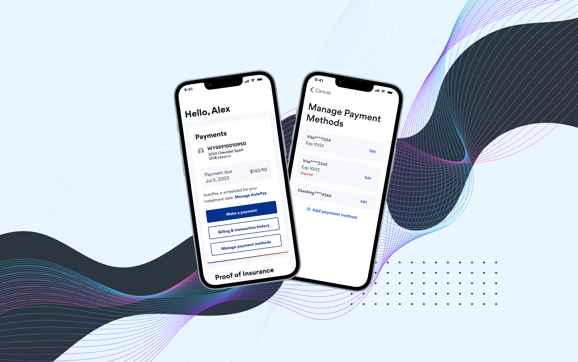
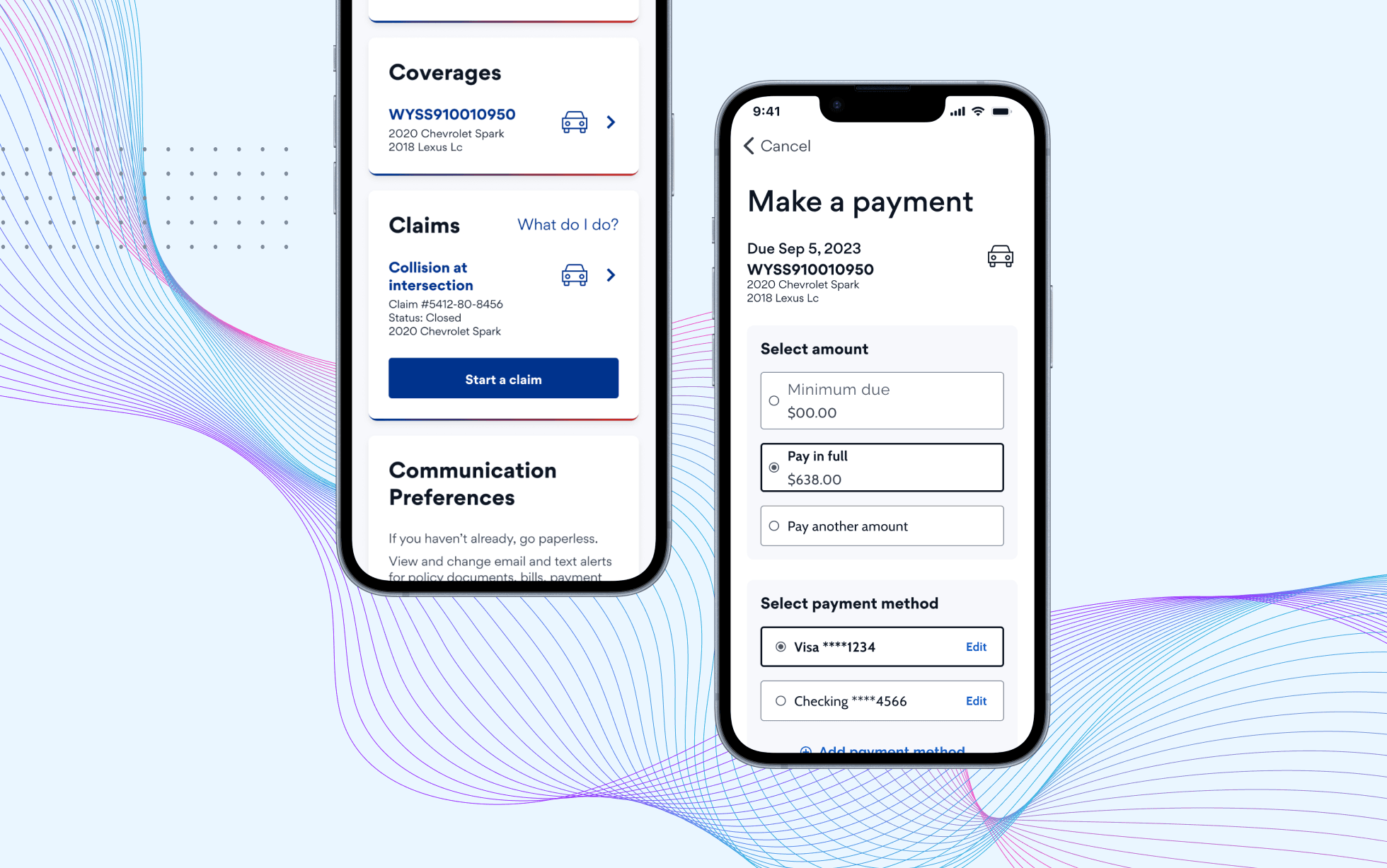
MyPolicy is a member-facing mobile app that allows insurance customers to manage policies, billing, and account information in one place.
When I took ownership of the mobile app, I found a significant disconnect: our design files no longer matched production. This made collaboration with product and engineering harder than it needed to be. Also, I found out that our design system was mainly support web experience, leaving the mobile app without consistent patterns or visual standards.
Individually, these issues felt small. Together, they created a fragmented user experience and made collaboration increasingly inefficient.
The Strategy: Winning Buy-in for Incremental Change
Given the team’s limited development bandwidth, a full redesign wasn’t realistic. Instead of pushing for an overhaul, I focused on making the problem visible. I synthesized my findings into a presentation and shared it with key stakeholders.
My goal was simple: gain alignment on strategy of incremental improvements.
This helped us set expectations early and I received buy-in to move forward with this strategy.
Audit and Prioritization
When Data Met Opportunity
The perfect moment arrived when our Marketing optimization team shared data-driven insights with suggestions for improvement. I leveraged this opportunity to execute the strategy I’ve prepared before.
I conducted a comprehensive UX audit and merged it with Marketing’s quantitative data. Working closely with PM, we prioritized opportunities using an impact vs. effort framework to target the most meaningful issues first.
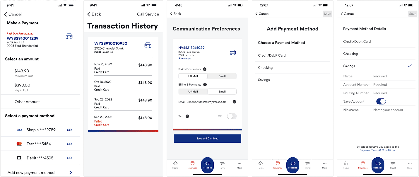
Design Improvements Example 1
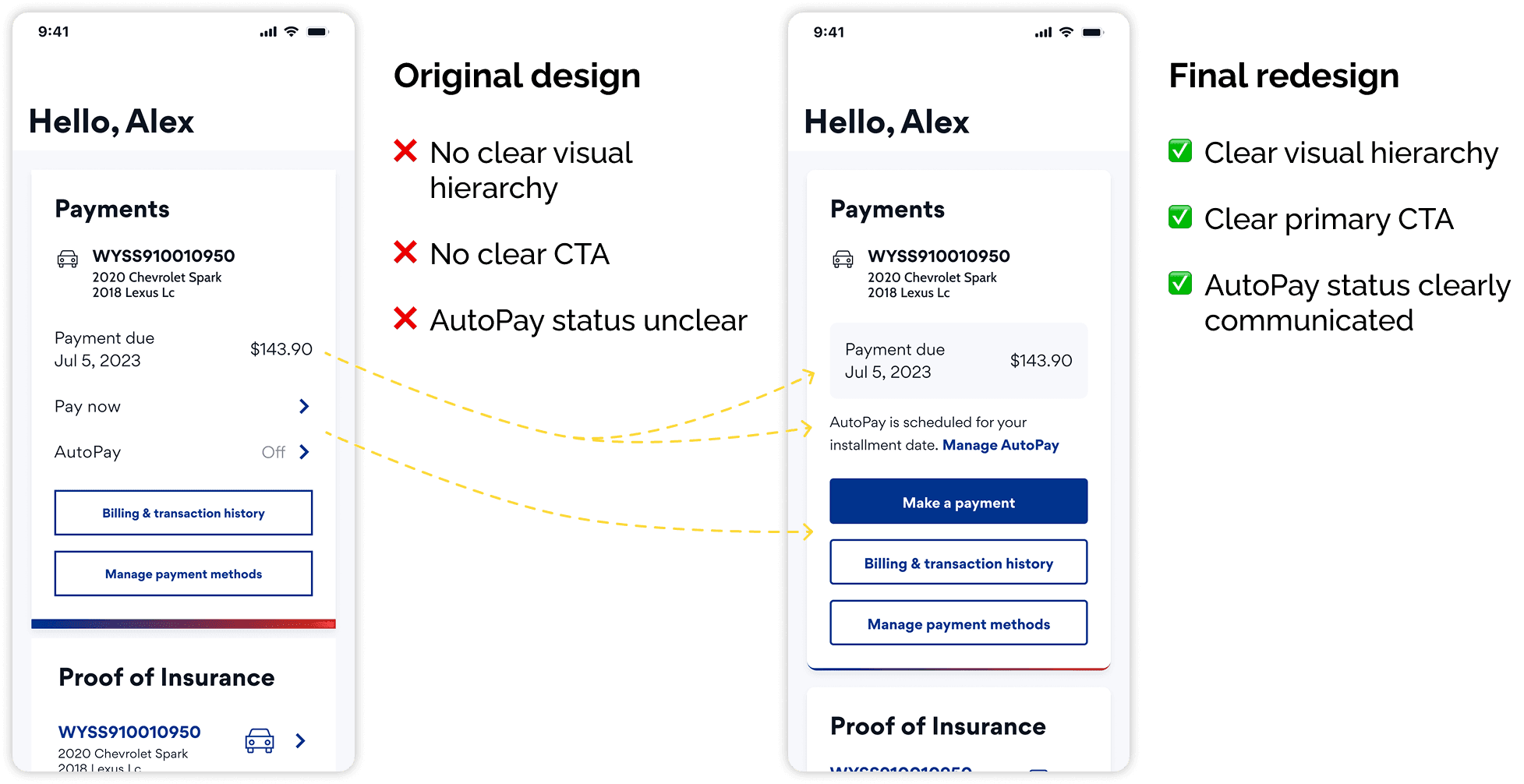
The AutoPay Ambiguity
Problem
Data showed that 74% of users enrolled in AutoPay were still making manual payments.
This suggested that the existing payment screen did not clearly communicate AutoPay status or what action users need to take.
Considerations
From a business perspective, we actually want to encourage payments, but we must clarify status.
From a technical perspective, payment data depended on billing information, which wasn’t always available in real time.
Design Process
My first explorations struggled with visual hierarchy - the AutoPay messages were either too subtle or too distant from the payment info.
Given the timeline, we conducted quick usability testing on the most promising options while I continued iterating. Results showed that users understood the new messaging, and most of them preferred a clearer call-to-action button.
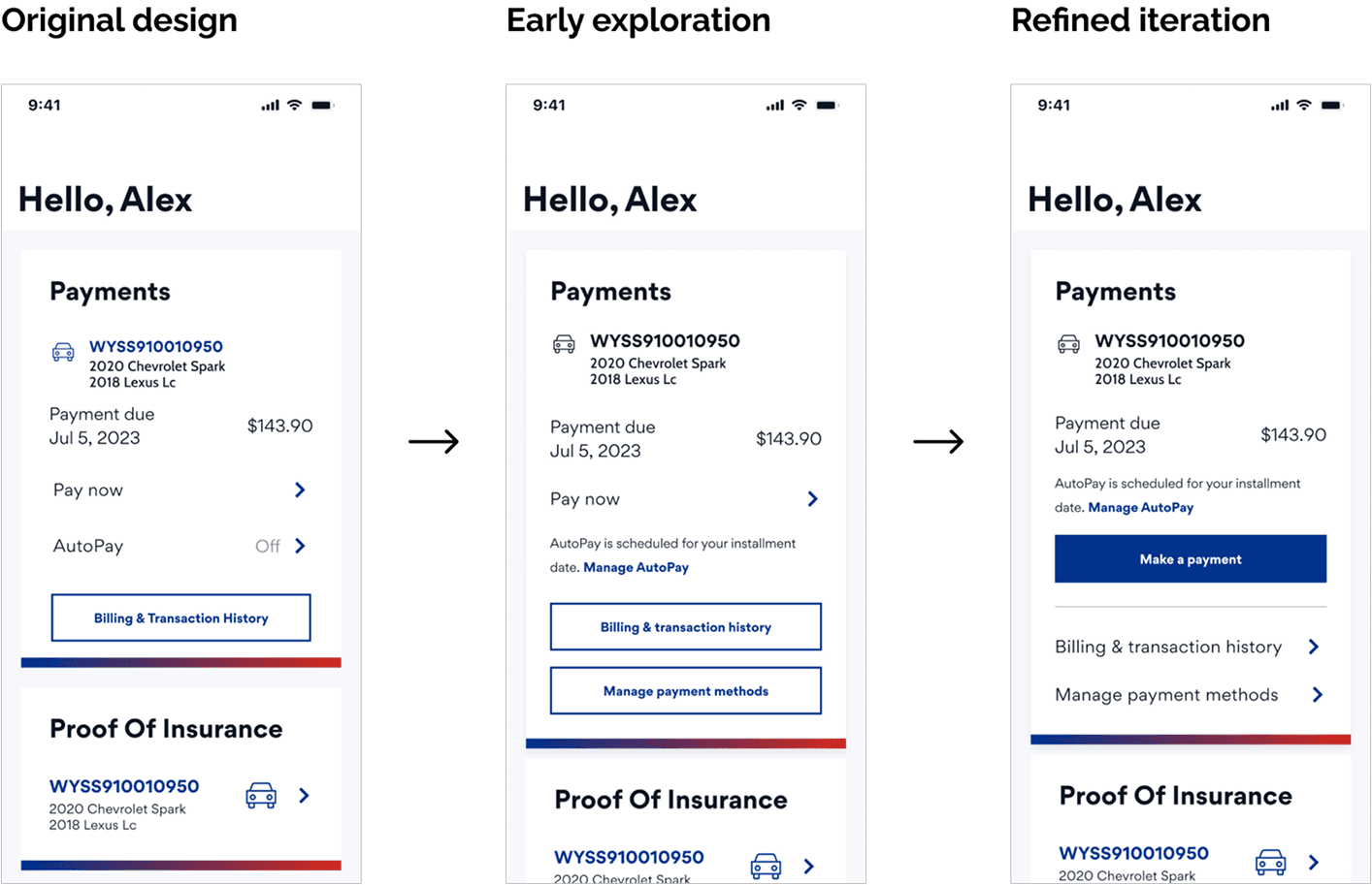
Final Decision
The final design introduced a clear AutoPay status message and improved information hierarchy and readability while not discouraged users from making a payment.
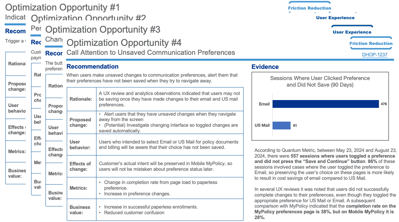
Design Improvements Example 2
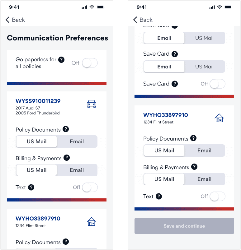
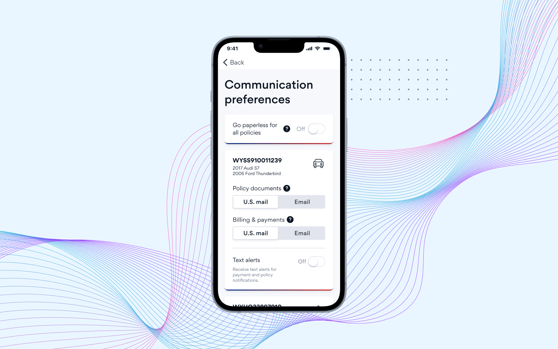
Missed Saves in Paperless Settings
Problem
When updating paperless preferences, 86% of users failed to save changes. The primary CTA sat at the bottom of a long, scrollable screen, making it easy to miss.
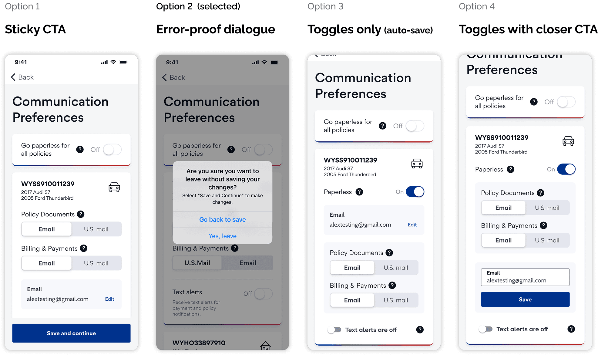
Exploration
I proposed four approaches. Each option came with trade-offs between usability, consistency, development effort, and long-term scalability.
Option | What it improves | Tradeoffs |
|---|---|---|
1. Sticky CTA |
|
|
|
|
|
|
|
|
|
|
|
Decision
After reviewing the options with stakeholders, the team chose the error-proof dialog. While it wan’t the ideal long-term solution, it offered a fast, low-effort way to prevent user error.
We also acknowledged that the overall flow was overly complex and would benefit from a future redesign.
The Outcomes
Design Results
Although the project was later paused due to shifting priorities, the work delivered immediate value:
Improved visual consistency across key flows, better aligned with production
Reduced fragmentation and smoother collaboration across teams
Stronger affordances (e.g., editable fields visually appearing editable)
A strategic foundation for future UX and visual enhancements
Even without major structural changes, the experience became noticeably more polished, clear, and consistent.

Key Takeaways
Designing in the "Stakeholder’s Shoes"
Being a designer isn’t just about advocating for the ideal solution—it’s about offering viable paths forward.
By framing options with clear trade-offs and understanding constraints, I was able to guide the team toward solutions that could actually ship.
Radical Ownership
I owned this work end-to-end—from audit to final delivery. This required bridging Marketing’s “what” (data) with Design’s “why” (heuristics), and translating both into actionable decisions.
The Power of "Ready and Waiting"
The early audit and strategy work allowed me to move quickly when the opportunity emerged. Being prepared made it possible to act when the right moment came.
Other projects

AAA Membership Purchase Integration
Integrating AAA membership into an existing insurance quoting flow, resulting in a 30% increase in online policy purchases.

Obran OS Redesign
A systems-level redesign of a cooperative platform to clarify financial structures, membership, and internal capital accounts.

BTD Curb Management Platform
Designing a geospatial data platform for the Boston Transportation Department to visualize curb assets and parking regulations across city streets.
