AAA Membership Purchase Integration
Integrating AAA membership into an existing insurance quoting flow, resulting in a 30% increase in online policy purchases.
Role
UX Designer
Industry
Insurance
Duration
1 year

Understanding the “Gap”
With a typical e-commerce mindset, I was surprised to find that insurance is still a hybrid experience heavily relies on agent assistance.
Through SME and stakeholder interviews, a few things became clear:
The Gap: AAA membership wasn’t part of the online flow. If users didn’t already have one, they had to leave the site and call an agent to complete their quote.
The Problem: This "offline gap" led to significant drop-off and added manual workload for agents.
The Challenge: The quoting flow was already long and complex. We needed to introduce membership without making it feel heavier or more confusing.
How Might We: embed AAA membership purchase seamlessly with enough context to be clear, but not causing users to quit?
Strategic "Add-on" Approach
I approached this as an add-on purchase problem and looked at how similar experiences are handled in other industries.
Most successful examples introduce secondary products after the main selection and provide a clear, editable summary.
To validate this direction, we surveyed 450 prospective customers. One insight stood out:
Insight: Customers don’t primarily see AAA membership as a “club benefit”—they see it as a way to unlock discounts.
This meant they were much more likely to purchase if it appeared where discounts are already being evaluated.
Key Design Decisions
Based on these insights, we made three core decisions:
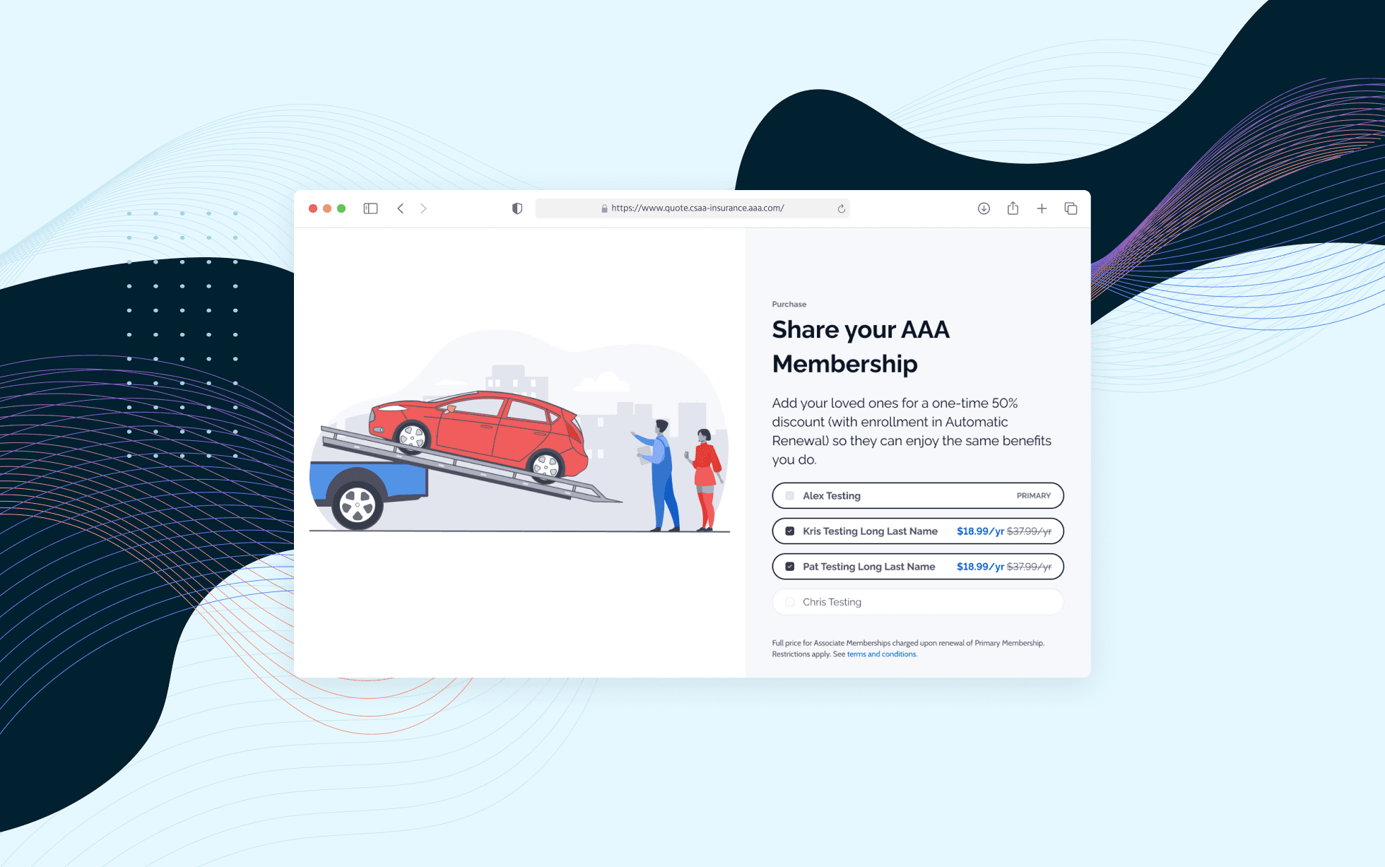
#1. Introduce membership purchase in the discount section (pre-payment)
I designed a custom AAA membership illustration using design system elements to ensure clarity and visual consistency.
#2. Offer only the most popular tier for MVP
While 49% of users preferred seeing all tiers, we launched with the most popular option (31%) to reduce cognitive load in an already complex flow.
#3. Keep it optional
Survey results showed a 20% drop in purchase intent when membership was required, so we intentionally allowed users to skip.
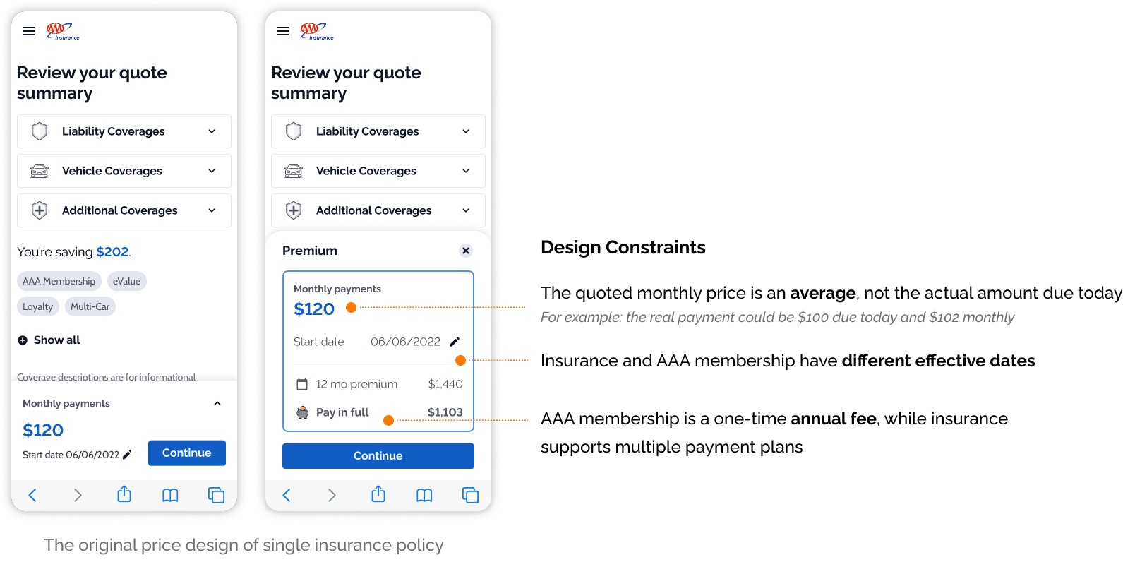
The Biggest Design Challenge: Pricing Clarity
The most complex and high-risk design problem - which I led end-to-end - was redefining how pricing information is presented once membership is added.
Insurance pricing is already difficult to understand (monthly vs. total vs. fees). Adding a separate membership fee made it even easier to overwhelm users.
Why this was hard:
Insurance and AAA membership have different billing rules, start dates, and payment plans — but they needed to feel like one coherent purchase without misleading users.
Designing for Pricing Clarity
#1. Defining the Primary Price
Choosing which price to emphasize was critical.
The goal wasn’t just accuracy; it was helping users quickly understand what they’re committing to.
To evaluate options, I aligned with stakeholders on the following design criteria:
Minimize confusion around payment plans
Stay consistent with the payment experience downstream
Support future product bundling
Fit within mobile space constraints
Design Exploration
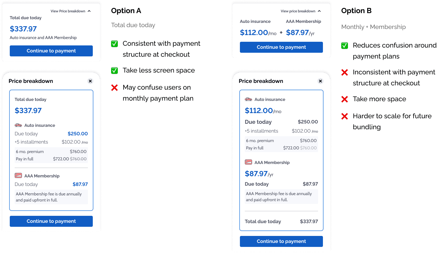
Final Decision
We landed on a hybrid approach that balanced clarity and accuracy:

This allowed users to understand the cost quickly without feeling overwhelmed.
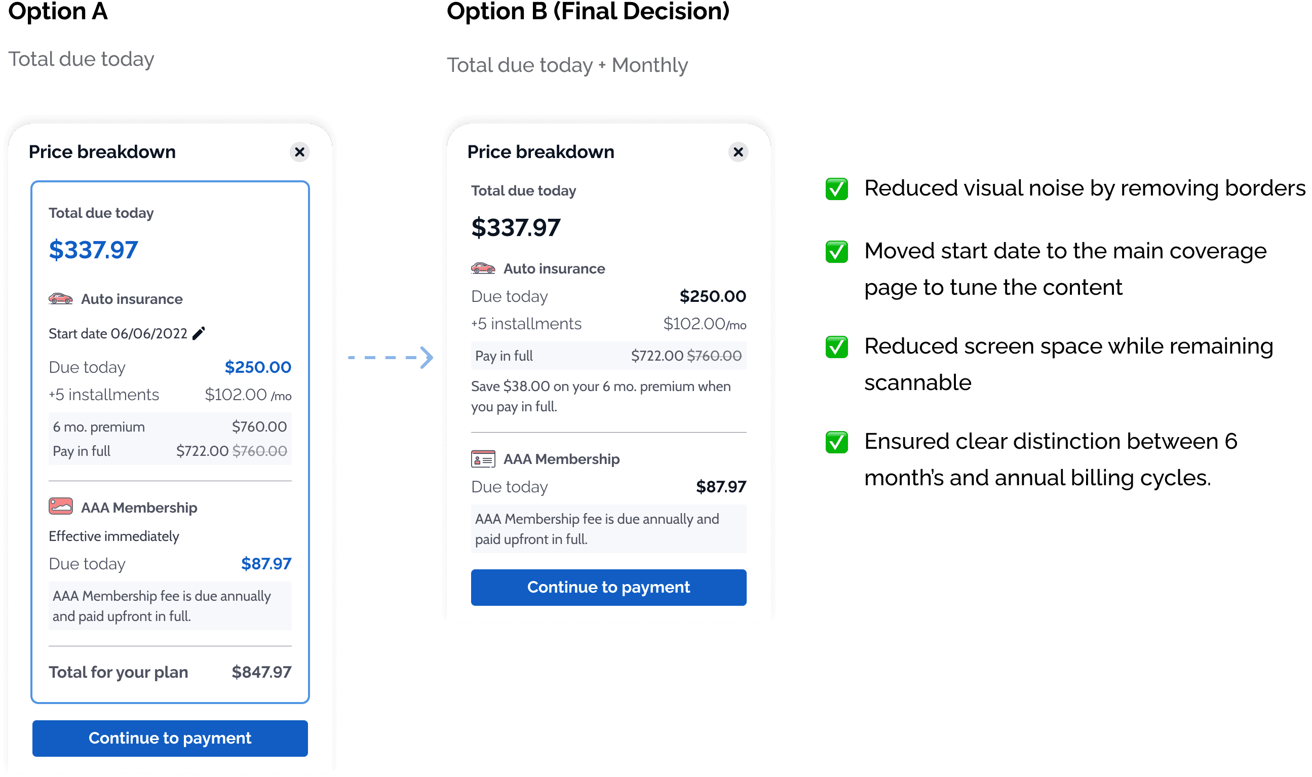
#2. Structuring the Price Breakdown
The price breakdown needed to communicate insurance premiums, installments, and annual membership fees without overwhelming the user. With limited space on mobile, the challenge wasn’t adding information, but deciding what not to show.
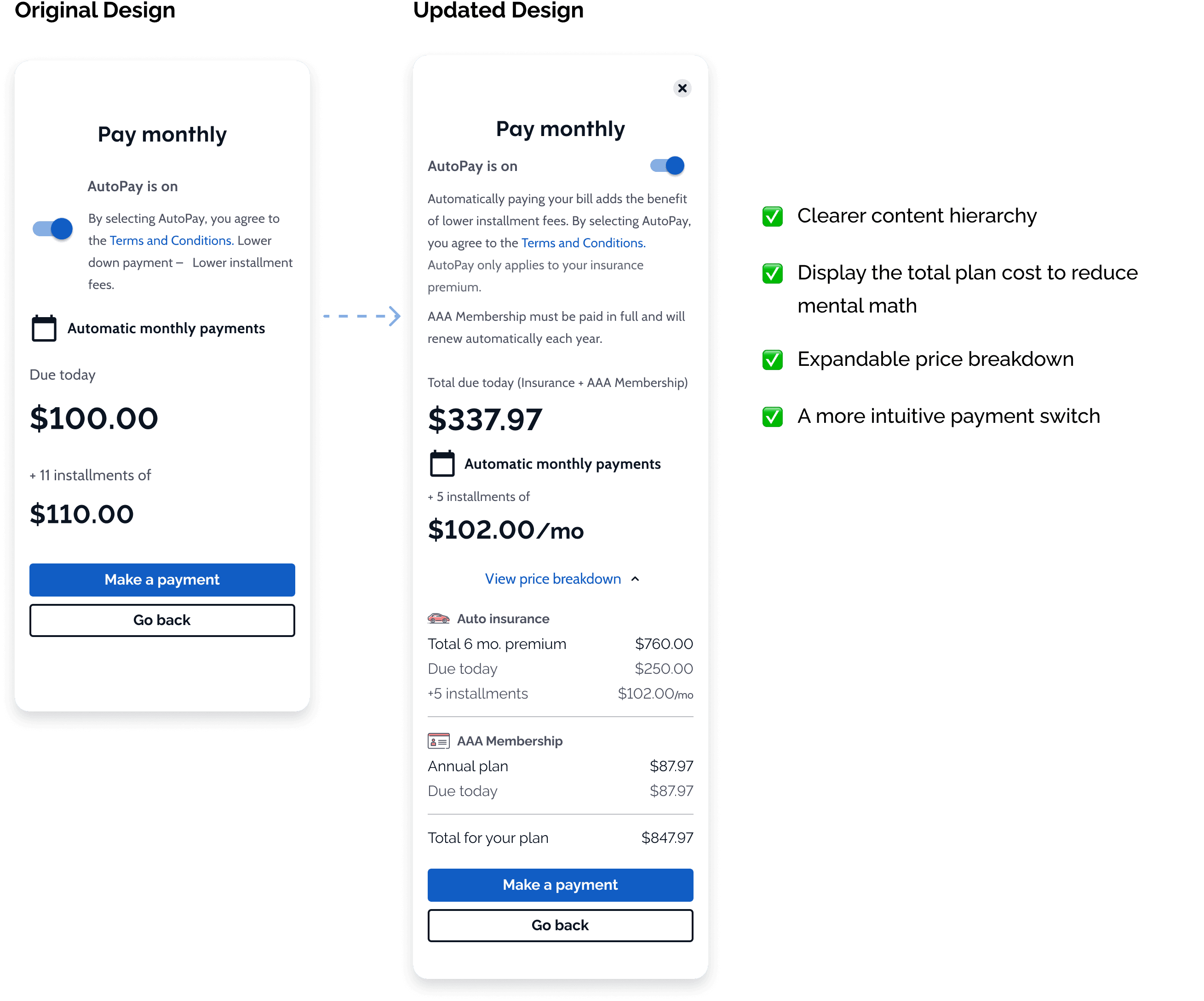
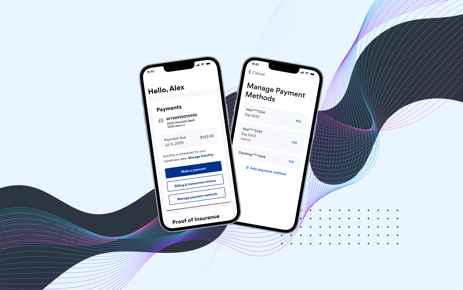
#3. Strengthening the Payment Plan
The payment screen is the final point of friction. Any confusion here leads to a "call-in" rather than an online bind.
I redesigned this step to reduce effort and make it easier to verify final costs at a glance.
Prototypes and Testing
I delivered end-to-end interactive prototypes after multiple rounds of iteration, incorporating feedback from heuristics evaluations, Marketing, Legal, Product and engineering partners.
In usability testing, we received 86.75 SUS score. 8 out of 10 participants naturally clicked "view price breakdown" to understand their costs. This was a significant improvement compared to prior testing, where most users failed to discover pricing details and expressed confusion about quoted premiums.
Results and Impact
The design has been rolled out to major markets including Arizona and California.
Expanded online eligibility: ~30% of customers who previously couldn’t complete purchases online are now able to bind independently.
New Member Growth: In CA region alone, we've seen 147 online binds that weren't possible before.
Younger Demographics: 58.3% of online binds with membership came from the 20-29 age group, proving we are successfully reaching a younger, digital-first audience.
Improved pricing comprehension: High usability scores and better discovery confirmed that added complexity did not reduce clarity.


Reflection
This project reinforced the value of focused ownership within a complex system.
While the overall flow was a collaborative effort, I led several high-risk areas, especially pricing, where clarity directly impacted trust and conversion.
It also strengthened my ability to
Simplify information without losing accuracy
Navigate trade-offs across design, product, and engineering
Make decisions that balance user needs with real-world constraints
Although the UI has since evolved, the core framework for membership integration and pricing clarity continues to shape the current experience.
Other projects
MyPolicy App: Scalable UX Improvements
Improving a fragmented legacy insurance app for 100k users through high-impact, incremental changes that bridge marketing insights and UX heuristics.

Obran OS Redesign
A systems-level redesign of a cooperative platform to clarify financial structures, membership, and internal capital accounts.

BTD Curb Management Platform
Designing a geospatial data platform for the Boston Transportation Department to visualize curb assets and parking regulations across city streets.
